Did you know that 4.5% of the entire population is color blind? About 8% of males and 0.5% of females are suffering from color blindness.
Color blind people find great difficulty in reading text, navigating options and experience a host of usability issues when interacting with websites. While in the throes of designing a website, nearly every designer carefully considers an array of visual elements, web design principles, the balance of shapes, the hierarchy of text, fonts, and images, and perfecting the harmony of colors. But sadly, there are many designers who overlook the predicament of color-blind individuals and turn a blind-eye towards this real-life dilemma.
It is critically important to know that a large number of people are suffering from a color vision deficiency, or color blindness. Not factoring in the whopping number of color blind people when designing your business website can make it difficult for them to use your website, which will negatively affect your readership and sales in the long run.
If your website incorporates some color contrast, text, and font issues, it can easily affect how customers interact with your website. To make sure that your website is highly assessable, here are some easy tips and tricks to help you create a positive web experience for color blind individuals.
Use Clear Color Names and Useful product Descriptions
One of the most common hitches that color blind individuals have to face is identifying the actual color of a product on an ecommerce website, and they usually end up soliciting the help of another person to discern the color. It is extremely important to pay careful attention to color choices and design decisions while creating such business websites.
If you are running an ecommerce store that sells t-shirts and if you only show an image of the shirt, it may be a bit difficult for a person with color vision deficiency to identify which color the t-shirt really is. In order to solve this issue, it is important to incorporate color detailing in your product descriptions to make it easier for your color-blind audience to choose the product of their choice.
Have a look at this example:
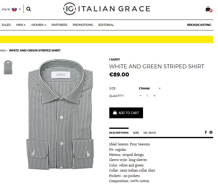
It is quite cumbersome for color-blind individuals to ascertain the color of this classic vintage logo t-shirt from SuperDry. Because they neglected to mention the color in the product description. However, Italian Grace intelligently specifies the color of this striped shirt in the title and comes across as a more sensitive brand.
Another brand that is working for the greater good is Gap, since they keep their color-blind audience in mind and specifically add a text label beside each color.
Amazon also made it easier to recognize the color of their products by popping up descriptive text when the user hovers over images.
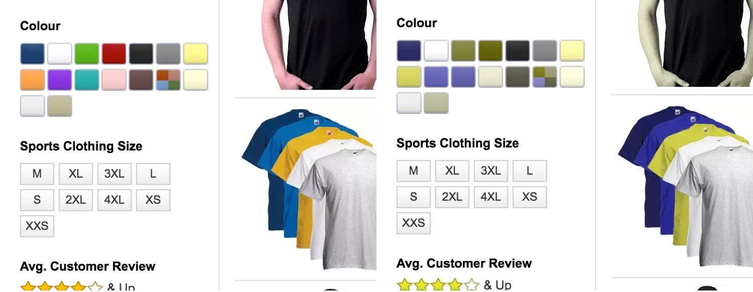
People with normal vision can also take advantage of this descriptive text. For instance, sometimes it is difficult to differentiate dark hues such as navy and black on a screen. However, adding a text label can solve the problem.
Use the Color Search Filters
Incorporating an effective color search filter with clearly defined labels on your website makes it hassle-free for people with protanopia to conduct a product search. For instance, Warby Parker uses color search filters which make use of both the color names and their symbols.
Avoid Color Specific Required Form Fields
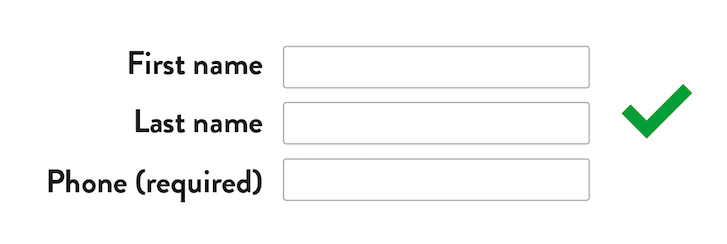
Denoting required fields with colors is a huge problem for those who can’t distinguish hues, because every field looks identical to individuals with a color vision deficiency. So, when it comes to designing a sign-up form, contact form, or any other type of form, it is highly recommended to write the text reference right in or next to the form’s label or perhaps use an asterisk to denote a vital field. This will make it readable for those suffering from color blindness.
What you shouldn’t be doing:
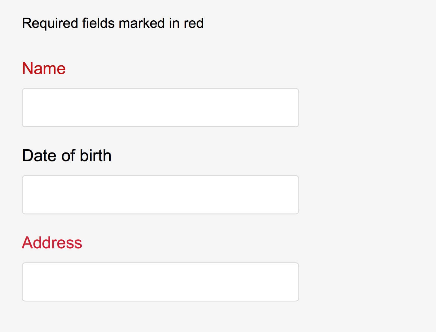
When done right:
Labeling your instructions clearly with the help of text is a sensible choice in order to avoid any confusion.
Have a look at Facebook form fields:

They have specifically chosen text labels in their signup forms, allowing their color blind audience to recognize common red error messages.
Use Contrast Wisely
Using a good contrast between the color of text and background is one of the most important factors which can draw your eye towards an important section of your website. In addition, achieving an effective contrast can make the text easier to read.
Color-blind individuals are able to identify bright colors more easily than dim hues. Designers can use vibrant, dark colors to make it hassle-free for individuals with color deficiencies to read the text. So, play smartly with colors in dark and light combinations to maintain a perfect contrast ratio. But make sure to stick to colors that perfectly align with your overall brand guidelines.
You can follow the Web Content Accessibility Guidelines (WCAG) or simply use the Contrast Ratio checker and WebAim color contrast checker to scrutinize if the text color, background color, and text size are sufficient.


Make Your Web Design in the Grayscale Mode
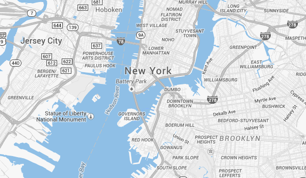
Make sure that your website looks equally good in the grayscale mode and that each element is distinctly visible. A lot of brands are making sure to keep this aspect in mind, since viewing your website in the grayscale mode helps you envision how it would appear to your color blind audience and help you tweak accordingly. Google Maps is an amazing example that looks perfectly great in its grayscale mode, capitalizing on different hues of gray akin to using red for busy and green for clear in its normal mode, allowing color blind people to view directions easily.
Steer Clear of Some Color Combinations
Thankfully, designers can control the colors they use on their websites and pick the best color combinations to create an amazing user experience for their color-blind audience. Here are some color combinations that you should NOT use while choosing a color palette for your website.
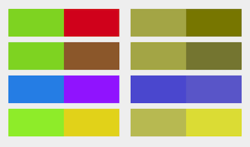
- Green & Red
- Green & Brown
- Blue & Purple
- Light Green & Yellow
- Blue & Grey
- Green & Grey
- Grey and Yellow
Use Links which are Easy to Spot
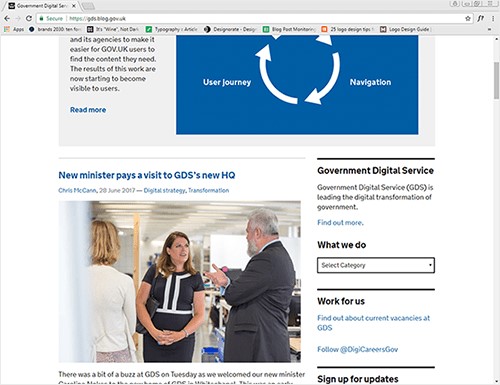
Refrain from capitalizing on color alone to denote the presence of clickable links on your website, as it would render it almost impossible for your color blind audience to spot them.
The website of UK Government Digital Service (GDS) would have someone suffering from Achromatopsia (total color blindness) scratching their heads in bamboozlement when it comes to treasure-hunting for a clickable link on the website. The only way left for them is to painstakingly hover over every possible word, holding their breath in anticipation, waiting to see if the cursor would transform into a pointer. Now imagine doing this with a mobile device! In order to ease navigation and make your website more accessible, why not incorporate icons to denote links, or even better, underline any hyperlinked text.
Over to You
Websites are meant to provide useful information to everyone in a more accessible and easier way. Creating a good user experience for customers suffering from a wide array of visual deficiencies must be a high priority to increase your chances of getting more leads and sales. These useful web design tips will surely help you create color blindness friendly UX designs that will render your website more accessible for everyone, including color-blind users.

