Remember that first job interview for an online business?
You are stumbling on every step, sweating your way out, not being able to think clearly, and realizing that you are shaking while you are talking with the interviewer.
Often, it is not about the interview itself; it is about the first impression that you create on the person conducting your interview.
Just within a few seconds, you are evaluated based on the way you look and communicate with the interviewer.
Mostly, they will create an impression of you based upon your expressions, gestures, and postures or the way you explain your skillset to them.
Similarly, when people visit your website, they will judge you on a few things. If the site is attractive, they will stick to it; if not, they will move on to the next best website in the list.
These tips will help you create an impressive experience in the eyes of the visitors.
Keep it Neat & Clean
Although Minimalism can generate more leads, every business has its target audience, which means you need to use an approach that fits the best target audience.
I am not going to tell you how to design a website; our custom web design agency can design & develop a website for you. But what I want to emphasize is that the website design must sync with your business values and the nature of your business.
There’s no point in developing a funky website if it doesn’t reflect your brand identity or fulfill your goals.
Sure, everyone wants a cool website. A website that can attract customers and facilitate them to do business with you. The goal of the website should be to give people what they want. That being said, a bland website cannot achieve such a goal. A neat and clean site with a seamless flow can help you to engage the customer and keep their focus on your product.
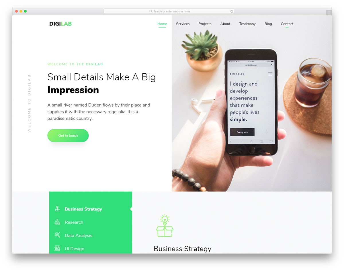
Check how DigiLab has placed the elements and did an excellent job of creating an attractive website design.
Quickly Satisfy their Needs
If you’ve ever attended a webinar, you may have noticed most of the speakers purposely beat around the bush before revealing anything productive. And they do this so that you can buy a book or pay something to get all the answers.
You don’t have to do any such thing on your website. Be prompt in offering your audience the information that they need. When the target audience gets the desired information quickly, they will not just love you; they will share the experience with their friends and family.
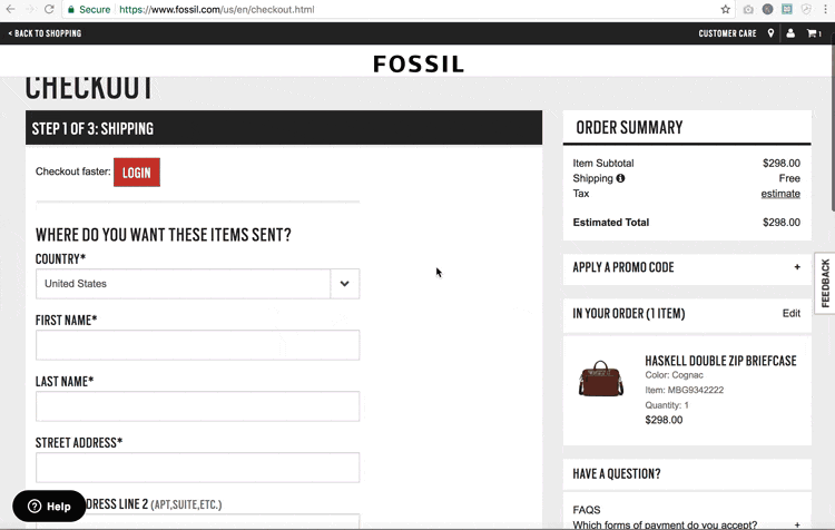
For instance, giving a return policy on the shopping cart page will save time for the user.
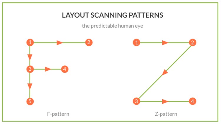
Choose One Layout Pattern
I’ve learned this from a senior website designer at my firm. There are two ways in which the visitor views every website. Either they see it in an F-shaped flow or a Z-shaped flow. And this is why bullet points get attention fast.
If you want the customer to view the critical information quickly, ensure those points in either of the two layout patterns.
Optimize the Loading Pages
If a page loads within 2-3 seconds, it gives an average bounce rate of 9%. But if it takes 5 seconds or more, it provides a bounce rate of 38%.
The most common problem that website owners face with a website is its loading speed. To deduce the speed of your website, you can do the following things:
- Begin by optimizing images and writing content in a web-friendly format.
- For images to load quickly, cache the images.
- To get the best results, it is advised to use a high-end server.
Speed is one factor that affects the ranking in search engines. How quickly your website loads represents what kind of business are you. If it lags then your image will be that of a company that doesn’t respond promptly to the needs of its customers. Therefore make sure your website is optimized to load quickly across different devices and browsers.
Use Catchy CTA Buttons
The only purpose of a Call to action button is to stimulate people to act desirably. What you need to make sure is to give the visitor an unforgettable experience.
However, it is essential that the flow of the page should not break, and the design must entice the user to act.
The CTA is just like a trigger that can motivate the visitor to take the desired action. It could be to fill out a contact form or drive the visitor to the portfolio page. To ensure this happens smoothly, the CTA must compliment the overall design of the page if you plan to blend it into the design and naturally turn the potential customers into revenue-generating customers.
These are some of the locations where you can put the CTA button for maximum results:
- Right at the bottom: The best place to start is by pitching the services and educating them with all your offerings.
- Somewhere in the middle: Right when you are discussing the important stuff, you can disclose your services on the page.
- Side CTA: When grabbing the attention of the users, it is necessary to change the place of the CTA to the side of the page.
To Wrap It All Up
It is all about offering a pretty good first impression. The hard part is to maintain that impression throughout the journey of the customer. Once, lost is it impossible to get it back. As the saying goes, “Never make promises you can’t keep”.
You must not overcommit to the customer at the start. If you have something worthy, offer it right there. If not, use the tips above to create something that will get people talking.